

1. The Surprising Story Behind the Shade
How Pantone Chose a Color Nobody Saw Coming ?
A Year Ready for a Bold Reset
Why You Needed This Color Without Realizing It ?
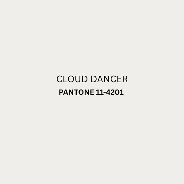
The story of Pantone 2026 officially named Cloud Dancer (PANTONE 11-4201), is honestly the kind of plot twist you would expect from a fashion movie, not a color system. You see designers and creators every year waiting like excited children for the announcement, but this year’s shade came with a dramatic flair that instantly made you say, “Wait… this is different.” Pantone didn’t choose the color based on passing runway noise or one viral moment. Instead, the team dug into global emotions, cultural fluctuations, and the strange-but-exciting creative comeback the world needed. You feel the shift too, right? This soft, airy shade has broken the quiet cycle of muted tones in its own subtle but quietly rebellious way.
The color represents the idea of stepping out at the edge of comfort, and you can sense how it mirrors the world around you. Designers whispered about needing “something bolder,” consumers wanted “something happier,” and the digital world screamed for a fresh identity. Pantone listened. The 2026 shade carries influences from sustainable materials, futuristic visual tech, and even emotional patterns studied throughout the year. By the time the color was revealed, you probably realized instantly that 2026 was going to be anything but predictable—and this shade is the perfect proof.
2. Mood Psychology: What This Color Says About 2026
A Shade That Speaks Louder Than Words
The Emotional Pull You Didn’t Expect
A Color Designed for New Mindsets
Let’s be honest, we’ve all been craving a mental clean slate, right? Well, Pantone 2026 is that feeling bottled up as a color. Think of it less like a sophisticated shade and more like the moment you finally decide to chop off all your hair and feel instantly lighter—it’s pure, unadulterated “fresh start” energy.
It’s the color that looks you in the eye and says, “You’ve got this.” It’s clear enough to make you feel like a creative risk-taker. The psychology here is simple: we’re collectively tired of the drama. We want to be happy, expressive, and confident, but without the exhausting performance of perfection.
This color gets it. It offers this incredible mix of a calming, grounded feeling alongside a fresh, uplifting sense of clarity. It’s the visual equivalent of your most supportive friend saying, “Seriously, go do the thing.” Whether you splash it on your wall or your favorite sweater, it’s designed to be a daily, no-guilt joy boost, signaling that it’s time to embrace your true, positive self.
3. Runway to Real Life: Fashion Forecast for 2026
How Designers Fell in Love With Pantone 2026 ?
Wearable Ideas for Your Closet
Season-Friendly Styling You Can Actually Use
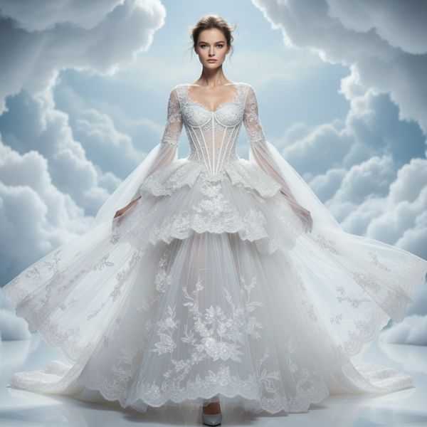
When Pantone 2026 hit the runways, designers didn’t just use it—they exploded with ideas. You saw it in unexpected silhouettes, accessories, and even bold outerwear that made the shade feel like it existed long before its official launch. But what truly matters is how you can wear it in real life without looking like you walked out of a color wheel. Thankfully, this year’s fashion forecast makes the shade surprisingly wearable. Light fabrics absorb it beautifully for spring, while richer textures like suede and vegan leather give it a dramatic autumn presence.
You can style it easily with your neutrals—yes, your blacks, beiges, and softer whites absolutely adore Pantone 2026 Cloud Dancer. And if you love experimenting, contrast it gently with deep green, silver chrome, or warm spice tones to create a clean, high-fashion balance. Accessories are your best friend this year because even subtle touches of this airy shade instantly freshen your outfit without trying too hard. Handbags, sneakers, scarves, and tinted lenses in Cloud Dancer already look ready to trend across street-style feeds. Designers also predict this soft white will dominate festival wear, luxury loungewear, and the return of refined layering. Basically, if you love a color that quietly lifts your whole look with minimal effort, this is your year.
4. Home Décor Makeover Ideas—Zero Overwhelm Edition
Small Changes, Big Aesthetic Energy
Pairing Pantone 2026 Without Repainting Everything
Décor That Makes Your Space Look Updated Instantly
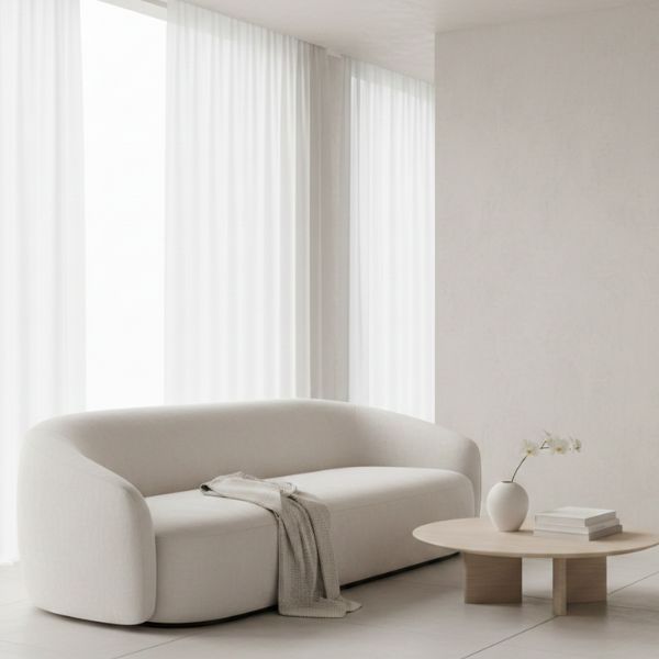
If you want Pantone 2026 in your home but don’t want your living room to look like a themed café, good news—you don’t have to overhaul your entire décor. With tiny tweaks, you can make your space feel refreshed without stressing about furniture changes. Start with accent pillows, table runners, or lampshades. These tiny décor pieces instantly warm up your room while still keeping your aesthetic balanced. You’ll be surprised by how effortlessly the shade blends with modern neutrals and Scandinavian interiors.
If you love textures, consider velvet cushions or woven throws in Pantone 2026 because they create an instantly cozy vibe. For a bolder move, try statement art prints or decorative ceramics in the shade. They catch the eye but don’t overpower your room. You can also pair this color with earthy terracotta, deep timber tones, warm metallics, or even crisp whites to form an elegant palette. For minimalist lovers, adding just one Pantone 2026 vase or planter is enough to make the room look “updated for 2026.”
Remember, décor doesn’t need to be dramatic to be effective. Even small hints of this year’s color can make your home feel fresher, trendier, and more aligned with your evolving mood.
5. Digital Aesthetics & Branding Trends Inspired by 2026
How Pantone 2026 Is Transforming Visual Identity ?
A Color Made for Social Media Branding
A Modern Shade for Digital-First Creators
Pantone 2026 didn’t just enter the fashion and décor world—it burst into digital culture with full force. If you spend time online (and let’s, be honest, you definitely do), you’ve probably noticed how brands quickly pick up new color trends. This shade instantly became a favorite for app designers, influencers, logo creators, and content strategists because it has both clarity and softness. It stands out on screens without straining your eyes, making it perfect for UI backgrounds, banners, thumbnails, and even product packaging mock-ups.
You will be able to see the digital creators using this Pantone 2026 for the website accents as well as social media grids and highlight the covers with its emotional warmth and fresh energy. For brands, the shade sends a message of modern confidence, allowing them to appear bold yet friendly. It also helps to photograph beautifully the meaning of your content that looks polished and with minimal effort. Designers like the color how its merges with the gradients and metallic filters with the futuristics overlays. This makes its ideal for the 2026’s tech-forward aesthetic.
If you really want to rebrand or refresh your digital presence in 2026 then Pantone 2026 is the perfect blend of clarity and personality. It’s a color that feels ready for the future—which is exactly why digital-first creators are rushing to embrace it.
6. DIY Projects that you can use the 2026 Pantone Shade
Creative and Crafty
Get Trendy Results with Simple Projects
Some ways to personalize your world.
Pantone 2026 is your new best friend and this color works beautifully in DIY projects. The color Cloud Dancer works beautifully in DIY projects with a clean and modern personality with advanced skills. You can start with something as small as phone-case painting or tote-bag stamping. Both take under an hour and let you carry a little trend with you every day. If you prefer home crafts, try painting frames, pottery, or little functional décor pieces like key holders. The shade blends easily with earthy or metallic tones, so your handmade creations look professionally designed.
For fashion lovers, upcycling is a fun way to include Pantone 2026 in your wardrobe. Add fabric patches, embroidered motifs, or painted details to denim jackets, sneakers, or canvas bags. You can even create DIY wall art using acrylic pour techniques or textured paste to make a gallery-style piece that feels high-end.
The best part? These projects let you express yourself while keeping your budget happy. You don’t have to have the artistic mastery but some expensive tools and you need to have the simple color with few supplied and your creativity. Pantone 2026 becomes your tool for turning ordinary items stylish pieces that match the spirit of 2026—fresh, uplifting, and confidently original.
FAQ: Pantone Color of the Year 2026
It draws from global mood shifts, creative renewal, and cultural optimism.
Because its tone steps away from muted trends and brings pure emotional clarity..
Yes you can if you admire and styling with some accessories and layering.
Absolutely—small accents are enough to elevate your space.
Earthy browns, warm neutrals, crisp whites, metallics, and deep greens.
Yes this color is screen-friendly and visually strikes the digital aesthetics.
Good for painting tote bags and pottery frames for crafts.
It adapts beautifully across fabrics and textures year-round.
Yes, it already shows signs of influencing fashion, décor, and tech.
Its selection reflects growing eco-conscious design preferences.